Tuesday, November 20, 2007

Quick Tip

Ok today’s blog is really simple. Beyond simple but I needed it so maybe you need it too.
How do you get 3 4x6 picture backing papers out of one 8 ½”x11” piece of cardstock? I always forget this even though it is mind numbingly simple. So here you go.


I made a little picture here and I have it up in our studio. The grey parts are scrap…but! You can use the scrap after cut # 4 for a backing on a text box or smaller picture. That is what we usually do.

Wednesday, November 14, 2007

Designing on a grid.

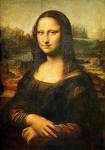
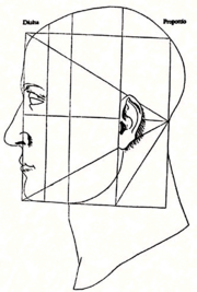
Ok everyone knows the rule of thirds….No? Well here it is. The rule of thirds says take your paper and divide it into thirds horizontally and vertically. Then use this grid to layout your designs. It is a good concept but there is a better rule, and it is only different by a little. The new rule is the rule of Phi. Phi is the mathematical term for an ratio found all over the place in nature and art (1:1.618033988), Also known as the Golden Rectangle. The Mona Lisa is constructed of dozens or even hundreds of these rectangles. Here is a spiral Constructed from them. The Parthenon was constructed of hundreds of golden rectangles. And the human body is marvelously constructed of golden rectangles And you can use them in your scrapbooking too.
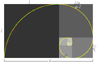
Here it is 7.416 (also 7 7/16) If you use a 12 x 12 sheet of paper then 7 and 7/16ths inches is your friend. Draw a vertical line at 7 7/16ths inches and you have a Golden Rectangle. Then measure from the other side and draw another line at 7 7/16ths. Do the same from the top and bottom. Here you have the start of your grid. Use it to place your pictures. On the page and see what happens. You can either center your pictures on the intersections or use the lines as guidelines for the edges of your pictures, it doesn’t matter both approaches work. You can get more elaborate too try drawing a line from one intersection to the corner of your paper. Wherever the line crosses another line draw a horizontal and vertical line [pic] using this approach you can create a more complex grid for placing your pictures. Every time you draw another line you create more golden sections and more options for you to place your pictures using a method proven over thousands of years and used by the greatest minds in art and science.

Some people will say that using a grid like this is limiting to them. And in some way I agree but I also think it is freeing. How much time do you spend shuffling pictures up and down back and fourth to get just the right placement? Using a grid of golden rectangles you will be amazed at how that time is cut down to nearly nothing letting you spend your time on more important things like picking those pictures and thinking up just the right quote.
Next we will explore some layouts using this model. Stay tuned!

Jeanne and Jospeh

Friday, November 9, 2007

Working in the Grid

Ok here is the idea of the 9 box grid. With this concept you can create all kinds of layouts. here I run through ten in just a minute. Click on the picture to the right to see what I mean.
In the animation you see 10 different designs that quickly came to mind using this grid. I was just having coffee with the Artistic Director of Big Fig Design (http://web.mac.com/bigfigdesign/) and we were talking about how all design is based on this grid.
Look around you right now. Is there a news paper, a magazine, an advertisement, a product package, anything. now look close, squint your eyes. can't you make out the grid? Look close almost every good design is based on a grid...
Now let me be perfectly clear "Almost" does not mean "Every". Not Every good design is based on a grid. Just most of them. Look in your favorite scrapbook magazine and see if all of your favorite designs in that issue use a grid of some kind to layout all the elements.
Next... What do you do with the grid?

Thursday, November 8, 2007

An article idea

I am thinking about writing an article about scrapbooking for a magazine. I have had several ideas but the one I am toying with right now is the idea of the 9 box grid. It is a Principles based layout idea. Using this concept I was able recently to develop 56 layouts in about half an hour. Really! That was just by coming up with 14 basic layouts and then rotating them each 90 degree rotation gives a totally differnet feel to the layout. Some work one ot two don't but for the most part. they work great.

Wednesday, November 7, 2007

Designing for Scrapbooking

Hello! This is our first post about scrapbooking design. so Who the heck are Joseph and Jeanne?
We are an artist and a practical scrapbooker. What a combination. Together we run several scrapbook related businesses and have a wonderful family.

On this blog we will share ideas for scrapbooking and you can share yours. We want this to be an open exchange of ideas and posts all about scrapbooking. So let's go!

joseph & jeanne